Portfolio of Mike Silvia Owner, M Design Co. LLC
Focus Areas: Creative Direction, Design System, Branded Materials, Multichannel Campaigns, Promotional Materials, Social Media
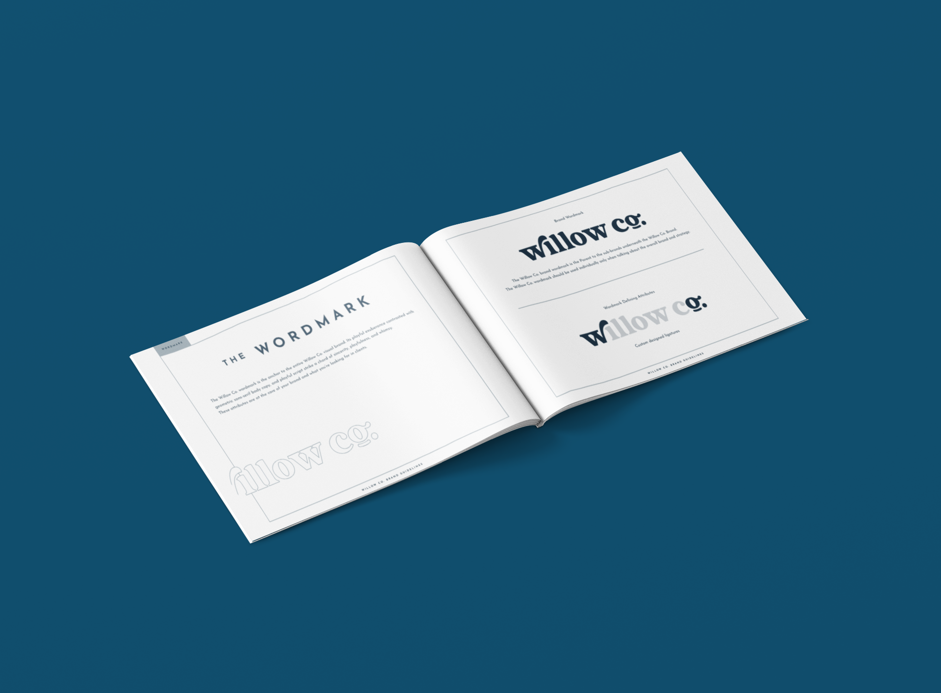
I was approached by owners of Willow Co., Ryan and Jenn. Ryan had been an integral part of my wedding day, and I was excited to work with him to evolve his brand, to bring in his partner into the mix, and move away from a company with his name at the masthead.
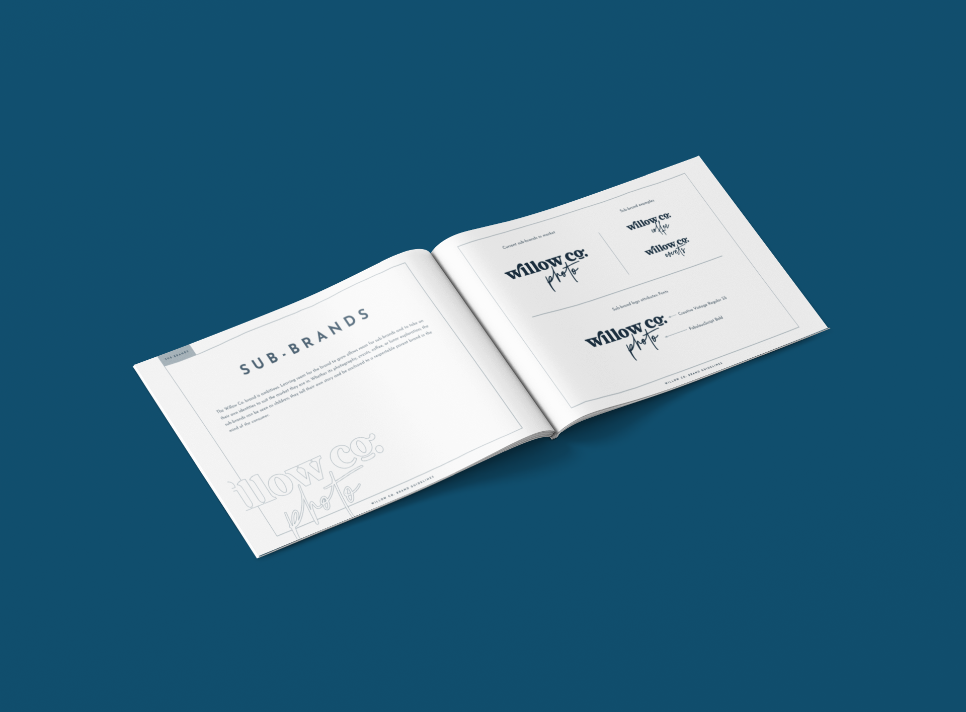
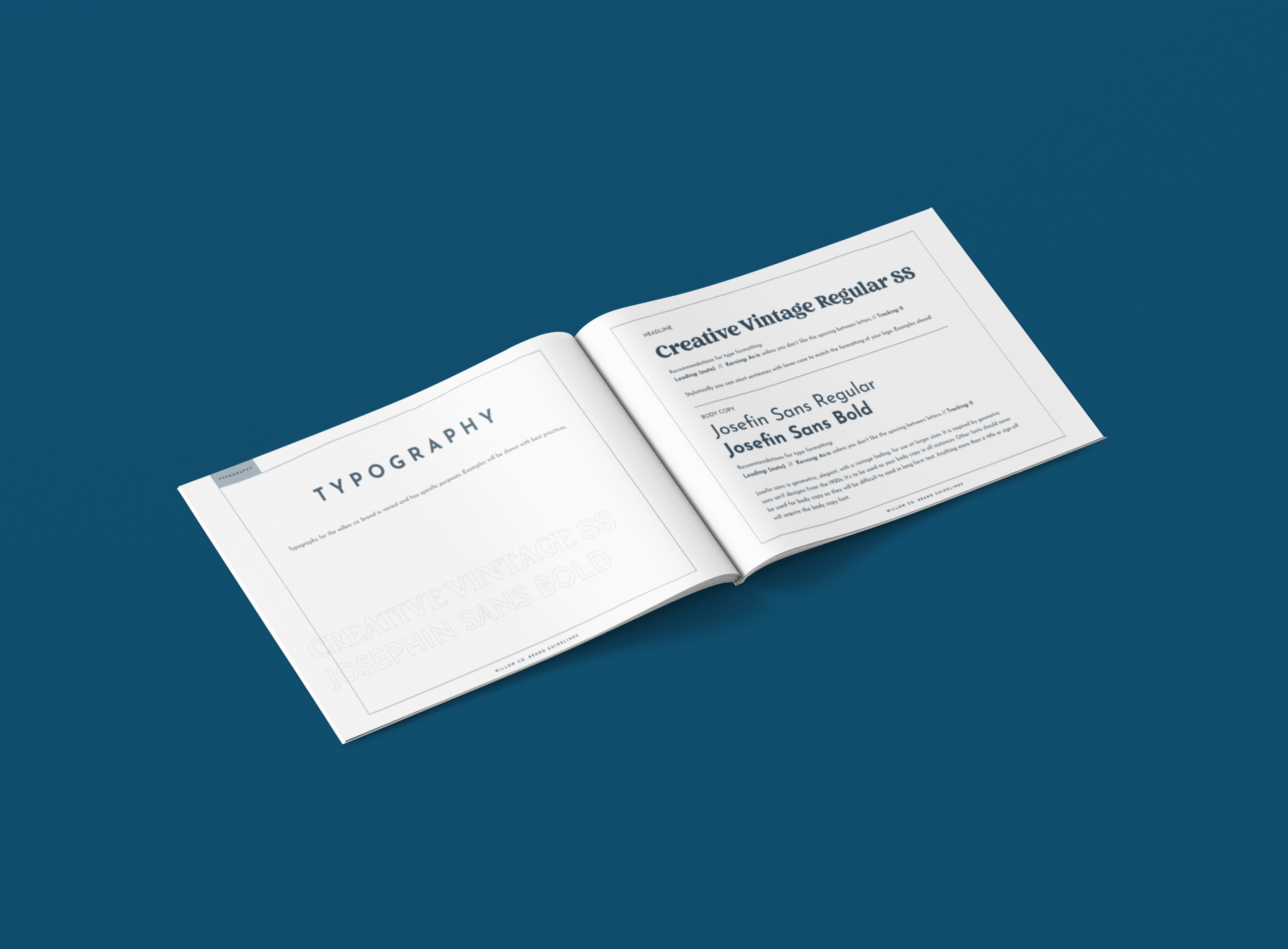
Both Ryan and Jenn envisioned a future for their business that went beyond photography and videography, so we created a parent brand, Willow Co. with children that can be added underneath as the organization scales. First to go under that masthead was Willow Photo Co., which has had a successful rollout creatively, using Polaroid style visuals and retro-inspired social graphics to keep their clients informed throughout the process. Additional asks were event attire designs, as well as a style guide to keep everything on-track when I couldn’t be there to move the brand forward.
Focus Areas: Creative Direction, Logo Development, Event Design, Branded Materials, Multichannel Campaigns, Promotional Materials, Social Media
Postal threw their annual “Opptoberfest” at the SaaSter Conference. A few weeks out from the event I got to work creating a new Logo and brand for the event to help it stand out from it’s past look which was quite dated. Taking influence from traditional Festbiers utilizing a blue diamond pattern and vibrant orange accents.
Focus Areas: Creative Direction, Design System, Branded Materials, Multichannel Campaigns, Promotional Materials, Social Media
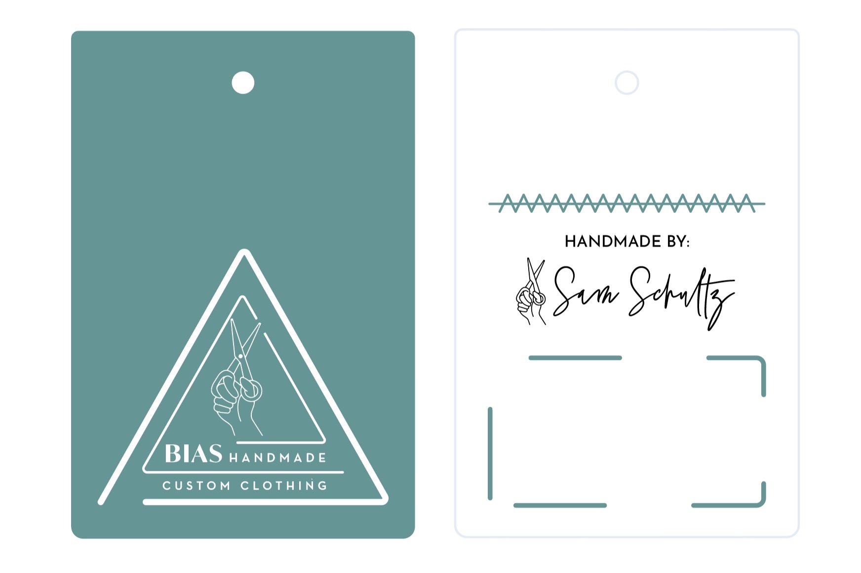
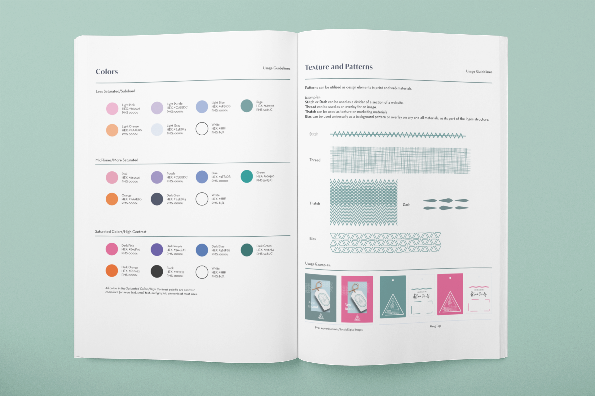
I was approached by the owner of Bias Handmade., Sam. Sam is a 3rd generation tailor and wanted to find a way to take their brand to the next level.
We got together and found a common ground on concept, and executed from there. I created a few options that invoked power, skill, and hand-made craft. A logo, icon, color palette, patterns, and marketing materials were created to round out the brand so that as it grows, it has the legs to be taken to the next level.
A style guide was developed to keep everything on-track for Sam as they grow their business.
FOCUS:
Creative Direction, Logo Development, Brand Development, Branded Materials
The logo for Data Scientist Sarah Mathey embodies a timeless and understated aesthetic, aligning with her vision of subtly highlighting the uniqueness of the data she shares.
The design features a clean, sans-serif typeface that conveys professionalism and modernity, ensuring clarity in communication. The color palette is muted, consisting of cool blues and soft greys, creating a sense of calm and reliability—essentials in the field of data science.
Incorporating a minimalist icon that subtly represents data, such as a simplified graph or a stylized data point, adds a layer of depth without overwhelming the primary focus on the content. The overall composition balances elegance and functionality, making the logo versatile for various applications, from presentations to business cards.
This design will serve as a lasting visual identity for Sarah Mathey, reinforcing her brand while allowing the uniqueness of her work to take center stage.
Using the initials for the business, I created letters from scratch to resemble a paned window, or the separation of 2 floors between the MN/HS. Additionally, The shape mimics a typical gable roof. The separation of colors creates great contrast, causing image will stand out on any application it is placed on for clothing or printed item. Finally, the font is Futura, which is a common system font on most machines apple and windows; so it should be easy to stay consistent and on-brand without speciality elements.
Focus Areas:
Creative Direction, Design System, Branded Materials, Exterior Signage
The new owner of the oldest general store in the country (located in Dartmouth, MA) reached out to me about branding their new business. They wanted to memorialize the feel of the period, but also make it feel modern and elegant. They intended to sell fresh foods, prepared meals, and the usual general store conveniences for people living in the direct area and local villages of Dartmouth. I was proud to create a design that would last another lifetime, and leave my mark on the history of this location.